Funding Service Design: Using content design to reduce the burden on applicants

In September 2022, I started on a new project as a content designer in the Funding Service Design team, where the aim was to:
create an easy-to-use experience for applicants and assessors bring greater consistency across funding rounds and funds generate accurate data remove unnecessary barriers to fundingHere are a few things I learned along the way.
Sometimes the simplest tools are the most powerful
In a nutshell, part of my role on the project was to help onboard funds to our GOV.UK service. The service was essentially an application form for whichever fund we were working with at the time.
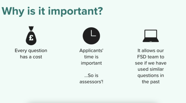
By the time we started to work with fund teams, they were usually already thinking about the data they wanted to collect from applicants as part of the application stage. Sometimes that data was more of a ‘nice to have’ instead of fundamental information an assessor would need to make a decision.
We found that running question protocol workshops really helped prompt the fund teams to think about:
who at DLUHC will use the answers to each question what they’ll use them for
If a data point could not be justified, then it probably was not necessary.
These sessions took time – often longer than an hour – but were always our most valuable tool. With that information, we were then able to start thinking about the flow and the content of the questions.
The best thing about question protocols is that they’re relatively easy to set up and run. All you need is a table with some column headings to get started.
Read more about question protocols from UX Matters.
Showing the thing does not always mean it has to look pretty
Our work with fund teams meant there were always things to show, like user journeys, patterns, components and content.
One thing we soon realised was that we were spending too much time on creating polished mock-ups in Mural. I think there’s a tendency to do this as designers. We want things to look good, especially if we’re showing it to other people.
It was also always inevitable that we’d have to make changes to these designs because we were still so early on in the process, meaning that all our hard work to make things look polished was a waste.
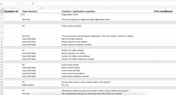
Instead of Mural boards, we decided to trial a simple Excel spreadsheet. We included columns for:
the question reference number the data element the content itself (usually the question or hint text) if it’s conditionalAfter trialling the approach, we found that overall this was a quicker way to:
pull the content together allow people in the fund team to sign off on the content or suggest changes
Using spreadsheets for design work is not groundbreaking, but it’s not something I’d ever really considered before.
What next?
Our next goal is to continue building up a bank of standard questions, so that fund teams can take question blocks off the shelf and do not need to spend time reinventing the wheel.
There will always be a small amount of bespoke questions, because each fund is unique, but there are many questions which are the same across multiple funds – such as organisation name. This will mean we have reduced the burden on fund delivery teams, as well as the burden on fund applicants. Win win.
Read more about the brilliant work happening in DLUHC’s funding service design team.
Subscribe to our blog for the latest updates from the team or visit our careers page if you're interested in working with us.
When you subscribe to the blog, we will send you an e-mail when there are new updates on the site so you wouldn't miss them.

Comments